Atlanta’s patterns of segregation and where they originate

This is a 1938 Map of the City of Atlanta. It was made by the government-sponsored Home Owners Loan Corporation.
The colors are grades for neighborhoods. The red swaths identify each area with large African-American populations as being a “hazardous place to underwrite mortgages.” This is what was known as redlining, and it was perfectly legal for many years.
You can read about these maps, which were made for most large US cities, in the NY Times article “How Redlining’s Racist Effects Lasted for Decades,” which covers a book on the topic: “The Color of Law: A Forgotten History of How Our Government Segregated America” by Richard Rothstein.
Redlining resulted in racial disparities in access to housing credit, which created strong patterns of geographic segregation that persist today. You may recognize some of the red areas on the 1938 map as being in places that have majority-black populations now such as Vine City, English Avenue and Mechanicsville. See maps of modern patterns here.
These lingering spatial patterns of segregation in Atlanta tell a story about housing-insecurity — one that is still evolving — for both buyers and renters. As the Times piece notes: “Blacks who did not have access to conventional home loans had to turn to schemes like contract sales that entailed steep interest rates (the practice is returning today in many of these same communities)…Slumlords, too, would move in, squeezing value from subdivided rental homes that otherwise might have been owned by families.”
(Note: this is obviously a very simplified version of the story of discriminatory housing practices in Atlanta. For a much more indepth review, please see the excellent, award-winning Color of Money series from the AJC in the 1980s.)
Population stagnation even with expanding city boundaries
Here’s a look at the differences in Atlanta’s population density between the era of this map and the modern one, from the 1940 and 2010 census data:
1940 Census
City of Atlanta population:
302,288
Population rank among U.S. cities:
28
Land size of city:
34.7 square miles
Population density of city:
8,711 people per square mile
2010 Census
City of Atlanta population:
420,003
Population rank among U.S. cities:
40
Land size of city:
134 square miles
Population density of city:
3,360 people per square mile
Did you catch that difference in density? 8,711 people per square mile in 1940 versus 3,360 today. The City of Atlanta’s population density dropped to less than half of what it was before, even as the land size quadrupled.
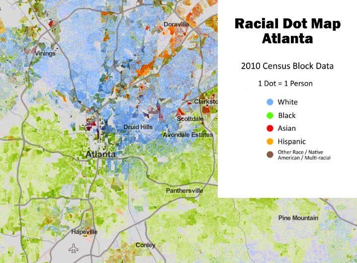
And if you check the Racial Dot Map from the 2010 census data (linked above), you’ll see that the geographic segregation widened as the population density lowered. It may be worth asking why, as suburban population boomed, the city grew outward in land while becoming more sparse in our density and more segregated in our neighborhoods.
It’s possible that the relative geographic immobility of black families is playing a part, as people of other races move more often. A Pew Charitable Trusts study of this subject touches on the situation in Atlanta, where this immobility is a major change from the 1990s when southern cities were gaining black migrants.
The racially lopsided effect of the foreclosure crisis and its recovery, hurting black homeowners disproportionately, likely has played a part in that loss of mobility.
In Atlanta, the National Fair Housing Alliance has documented that “banks have done a poorer job maintaining foreclosed properties in largely minority communities than in white ones.” The lowered property values reduce the impetus and ability of people to sell their homes at a price that makes financial sense.
This is according to a Washington Post article that covered the topic last year:
“Dan Immergluck, a professor at Georgia Tech, suggests that the area’s problems are a result of “cumulative causation” — all of these forces building upon each other. Controlling for poverty rates and the age and type of housing, his research shows Atlanta area Zip codes with larger black populations were more likely to suffer a steep decline in home values and experience little recovery.”
A call to conversation and understanding
Reading all of this, you might feel like these issues are too weighed down with deeply-entrenched racial and political conflicts to warrant open discussion, but that’s certainly not the intent of the post. The idea here is to inspire Atlantans to have important conversations, and to speak and act with compassion and sensitivity about the subject of housing.
Successfully addressing modern concerns like affordable housing, gentrification and infill density — this requires knowledge of the geographic and economic context established by these historical (and lingering) disparities based around race. Let’s talk about it. Keeping silent on the issues because they’re painful is not going to bring us closer to good outcomes.
EDIT: a reader has rightly pointed out a problem with the title of this post: mortgage discrimination is not the full origin of segregation in the city, as the title implies. There were other factors that put black Atlantans in geographic bubbles prior to redlining. With this post I’m focusing on the mortgage discrimination that stemmed from these maps and the lingering effects of it.
